Building the Praise Night One Pager
What I learned building the praise night site (currently hosted at http://krucial206.org/praiseNight or http://dchang.me/praiseNight):
I was trying to build something lightweight, and yet responsive, so I wanted to try to refrain from using Bootstrap. Here are some of my findings:
-
TTF font files don't work everywhere.
It looked pretty cool on the laptop, but then didn't show up at all on Suzi's iPhone - apparently importing a font through a .ttf file doesn't work on all devices. I was back to using the Google Fonts API:
<link href='http://fonts.googleapis.com/css?family=Open+Sans:400,800' rel='stylesheet' type='text/css'> <style> body { font-family: 'Open Sans', Charcoal, Arial Black, Gadget, Sans serif; } </style> -
CSS math has gotten better.
I wanted two divs - a fixed one on the left for the header and one on the right for the main content. I set the fixed left div to a fixed width, but then had no idea how to get the right div to fill up the rest of the screen. CSS math saved the day:
#rightDiv { width: -moz-calc(100% - 450px); width: -webkit-calc(100% - 450px); width: calc(100% - 450px); } -
Used, and then ditched, SlabText, a JS library, to resize headers to fill their divs.
https://github.com/freqDec/slabText/ meant that, in my left div header, I wrapped each line in a <span class='slabtext'>, then had to load jQuery and the SlabText.js file to load everything. The way I had set everything up, though, was that the left header is a fixed width, which meant that I really didn't need SlabText, as that's really used for responsive headers, and my headers weren't responsive at all. So I stole the calculations, as below, and removed jQuery and SlabText for speed. I went on to later realize that my design on mobile, which was somewhat of an afterthought, was now greatly limited, because all of the font calculations were written for a 320px div, but some phones or devices are wider than that.
#csbc { word-spacing: 0px; letter-spacing: -1.5px; font-size: 126.667px; } #praise { word-spacing: 0px; letter-spacing: 0px; font-size: 94.576px; } #night { word-spacing: 0px; letter-spacing: -1px; font-size: 101.825px; } #date { word-spacing: 0px; letter-spacing: 0.75px; font-size: 74.189px; color: #CCC; } #time { word-spacing: 3px; letter-spacing: 0px; font-size: 81.143px; color: #CCC; } -
I ended up implementing phone styles (like Zurb Foundation has), using media queries.
Used the media query off of http://css-tricks.com/snippets/css/media-queries-for-standard-devices/
@media only screen and (min-device-width : 320px) and (max-device-width : 480px) { .phone { display: inline; } .notPhone { display: none; } } -
Metadata for Facebook shouldn't be hard, but it's quite necessary if you're trying to do the social thing.
Reference: http://davidwalsh.name/facebook-meta-tags
<head>
...
<meta property="og:title" content="CSBC Praise Night" />
<meta property="og:description" content="Join us in worship, Friday, April 19, at 7pm. Chinese Southern Baptist Church is thrwing a praise night to praise our God - He is great and worthy to be praised! We are looking forward to a night of worship, prayer, thanksgiving, and fellowship, and we hope we can spend it with you." />
<meta property="og:type" content="website" />
<meta property="og:url" content="http://krucial206.org/praiseNight" />
<meta property="og:image" content="http://krucial206.org/praiseNight/logo.png" />
</head>
-
Started from HTML5 Boilerplate https://github.com/h5bp/html5-boilerplate
-
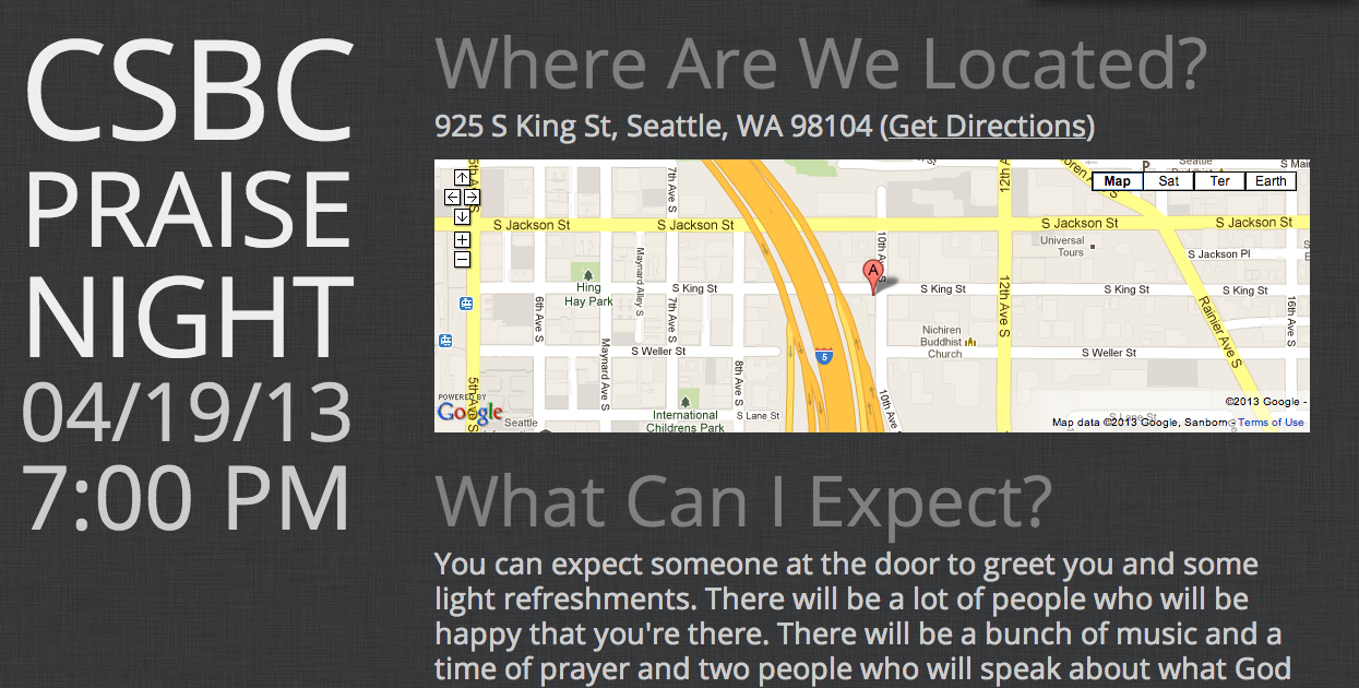
Ran into problems with the Google Maps embed.
I ended up settling with just doubling the code and using my .phone and .notPhone classes, as it was getting pretty late. On a phone, a white box would show up underneath the map, blocking the next section, and I couldn't figure out how to get rid of it, as much of the styles that I tweaked. The width=100% allows it to fill up its parent div's width and the height=100% fills up whatever is the parent div's height, which should be set in the CSS or else it will try to calculate a height based on its child which has no real height of its own.
<div class='notPhone' id='mapHolder'>
	<iframe style='overflow:hidden;height:100%;width:100%;' width="100%" height="100%" frameborder="0" scrolling="no" marginheight="0" marginwidth="0" src="https://maps.google.com/maps?ie=UTF8&q=chinese+southern+baptist+church&fb=1&gl=us&hq=chinese+southern+baptist+church&hnear=0x54900cad2000ee23:0x5e0390eac5d804f2,Redmond,+WA&cid=0,0,1748769979544881284&t=m&z=16&iwloc=A&output=embed&iwloc=near"></iframe>
</div>
<div class='phone'>
	<iframe style='overflow:hidden;width:100%;' width="100%" height="175px" frameborder="0" scrolling="no" marginheight="0" marginwidth="0" src="https://maps.google.com/maps?ie=UTF8&q=chinese+southern+baptist+church&fb=1&gl=us&hq=chinese+southern+baptist+church&hnear=0x54900cad2000ee23:0x5e0390eac5d804f2,Redmond,+WA&cid=0,0,1748769979544881284&t=m&z=16&iwloc=A&output=embed&iwloc=near"></iframe>
</div>
-
Finally did links the right way [and even used <section> to be semantically correct].
Set the anchor href to #the-id and set the section id to the-id, and everything just worked. I changed the padding-top on section so that it would line up with the top of the left header as well.
<section id='what-to-expect'>
	<h2><a href='#what-to-expect'>What Can I Expect?</a></h2>
	<div>You can expect someone at the door to greet you and some light refreshments. There will be a lot of people who will be happy that you're there. There will be a bunch of music and a time of prayer and two people who will speak about what God has done in their lives and why they love Him and believe He is the only way to heaven.</div>
</section>
-
Minified my CSS and just put it inline.
Reference: http://cssminifier.com/
And putting it inline meant the elimination of a network request. The file was pretty small though, so I don't think it would really impact the size of the HTML file.
Used a CSS reset.
There are a few out there (normalize.css, reset.css) - they pretty much "normalize" your CSS rules so that everything should theoretically look the same on any given browser.
Reference: https://github.com/necolas/normalize.css
Everyone's digging subtle pattern backgrounds.
Reference: http://subtlepatterns.com